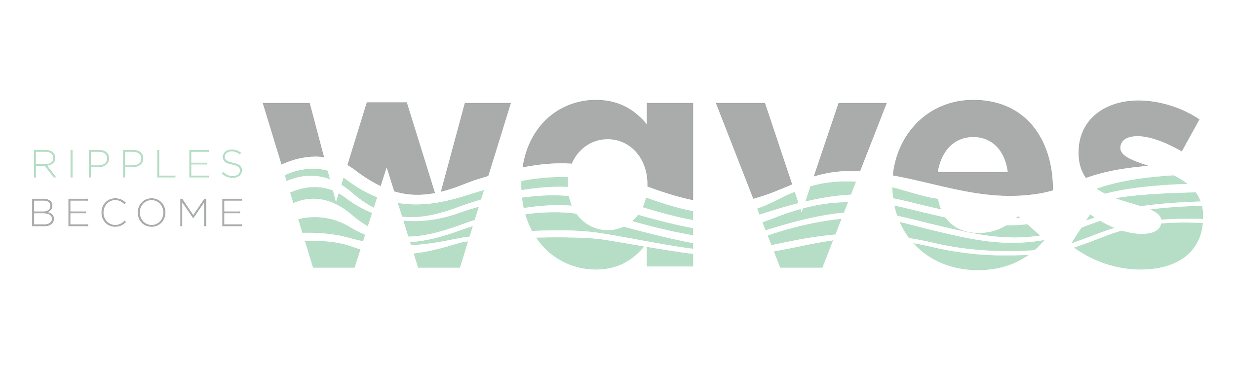
The Sutton

content altered for confidentiality


The Sutton | Brochure Design

Tactile print design for a concept rooted in momentum and transformation

Originally created as part of a confidential RFP response, this piece for The Sutton was adapted into a brochure layout for portfolio presentation. While specific content has been modified to protect client privacy, the visual strategy and design intent remain true to the original concept: clear communication, confident design, and a story of small changes creating meaningful impact.


Project Goals

  • Design a compelling RFP response that communicates both strategy and creativity

  • Create a print-ready layout that feels premium, focused, and visually memorable

  • Express the core theme: “Ripples Become Waves” — the idea that small, strategic moves can lead to large-scale transformation

  • Use a visual language that is tactile, calm, and authoritative


Creative Theme: Ripples Become Waves

The concept centers on the power of incremental movement—how smart, deliberate shifts can ripple outward into lasting value. To bring this idea to life, I designed a custom typographic treatment for the word “waves” with subtle wave forms integrated directly into the letterforms. This detail reinforced the theme without overpowering the overall elegance of the piece.

The color palette of pale dusty sage and deep charcoal grey set a calm, modern tone—suggesting sophistication, trust, and measured confidence. These hues carried throughout the piece, paired with clean grid-based layouts and generous whitespace for clarity and visual breathing room.


Design Elements

  • Custom wave-inspired typography

  • Soft yet grounded color palette (dusty sage and dark grey)

  • Modular layout design for flexible storytelling

  • Premium feel suited to print or digital presentation

  • Strategic use of white space and typographic hierarchy to emphasize key points


Deliverables

  • RFP response design, restructured as a multi-page brochure

  • Cover design with integrated theme lockup

  • Interior page layouts (cover letter, team, timeline, strategic approach)

  • Visual system built for clarity, elegance, and quiet impact

Note: All proprietary or client-specific information has been altered or replaced for confidentiality purposes. The version shown is for portfolio representation only.


Outcome & Reflection

Though this piece was created for a confidential RFP response, it stands as a showcase of how conceptual storytelling, restrained design, and tactile visuals can come together to create a high-impact print experience. The theme “Ripples Become Waves” became a unifying thread throughout the design—visually and conceptually—signaling that even small shifts can drive meaningful, long-term outcomes.